+200%
Follower growth
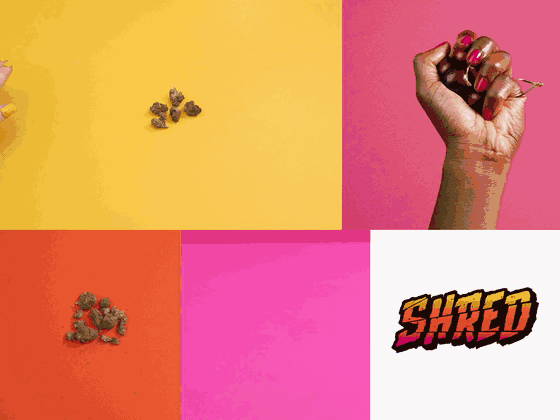
The first pre-milled cannabis brand in Canada, organised around one idea.
SHRED launched as the first pre-milled cannabis product on the Canadian market. A genuinely new format with real convenience built in. It also had no strategic identity to organise itself around.
Most cannabis brands talk about THC percentage and flavour. Important features, but they weren't helping SHRED stand out. As the first pre-milled product on the market, SHRED had an opening to lean into what actually made it different.
Product, messaging, and visual identity all organised around the same premise. Brand architecture (personality, voice, visual identity, messaging hierarchy), a comms framework, a reactive social strategy riding topical and cultural moments, paid and organic asset development, sales tools, programmatic display, and the full brand website.
Strategic approach. Brand architecture contribution. Personality, voice, and messaging hierarchy structured around simplicity as the organizing premise, rather than as a feature claim.
Content strategy. Reactive social framework for always-on content, riding topical and cultural moments in the target's world.
Communications planning. Channel prioritization across launch and sustain phases.